Step 1: Making the films title
Before I start make the poster I firstly decided to design the title for the film as every film poster shows off its title in large, detailed fonts to make them stand out from other films so that audiences can recognize the film just by looking at its font. This is seen in films old and new such as the Back to the Future (1985) which has its vibrant orange font and the arrow pointing towards the word back hinting at the films use of time travel and The Avengers (2012) which also uses a bold font with the most noticeable part being the letter A which is actually from the Stark towers headquarters the home of marvel superhero Iron man which will be recognized by comic book fans hyping them up for the film.
| Army Rangers font |
| Army Rangers font with our films title |
So I began creating the title but I needed to find a font that I could use that suited my film. To find the ideal font I went back to the plot synopsis my group created to see if there was anything I could use as reference when finding the font. This lead me to looking for military styled fonts as the plot of our film is a army strike force hunting down a escaped convict. Eventually I found a font on the website Dafont called army rangers which is based on the fonts used in many 80's action films. Before I used the font I decided to quickly see what the films title would look like in this font so after a quick test I decided this would be the perfect font for the film.
| Coloured font |
| Stripped font |
Now I could start editing the font to make it look more unique so that it stood out more. I started by changing the colours and settled on the colours red and blue as I wanted to the font to give of a patriotic vibe so I used colours of the American flag as the country as a whole is commonly associated as being very patriotic so I felt it would be a good use of the colours. I then decided to further apply this reference by adding white striped to the red stars as the stars and stripes are the key things on the American flag and our commonly associated with them.
To finish the title of I decided to step away from the patriotic vibe and went closer to the army effect as it is a key part of our film. So to do this I used the dodge tool which is used to brighten parts of photographs which can be used to make things look more detailed. However, I used the dodge tool to make parts of the font to look rusty and worn out. I feel like this helped create a army atmosphere as it reminded me of the conditions of army vehicles as they are designed to survive treacherous landscapes which they do but over time they show signs of rust and decay so I wanted to convey that effect in the font. Below you can see the finished font that will be used in the final poster.

But as I later realized after receiving some vital feedback on the poster I decided that I needed to completely overhaul the main font that I had been using. This was mainly because the poster had far to many conventions of the action genre with very little of the horror genre which made them look like that they had been tagged onto the poster at the last minute which made it look less professional.
 |
| My films title in this font |
 |
| The new font |
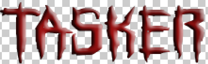
 My next step was to edit the font to make it more conventional to the horror genre. I did this by firstly, changing the colour of the font to red as it is a very conventional colour for the horror genre as it connotes with meanings such as violence, death and blood. I then used several other effects to darken the colour and make the text look 3D so that it stood out more. You may also notice that I have added loads of holes into the letters and this was done as I wanted them to look like bullet holes so that they showed conventions from the action genre.
Step 2: Taking photos
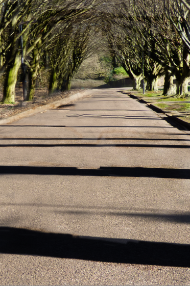
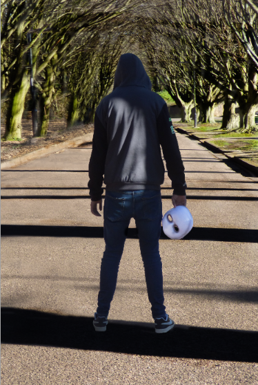
The next step was to take the photographs that will be used as the background for the poster. To determine the location we decided to pick one of the locations from the location recce we did as we were all familiar with them and it would make it easier to then set up a photo shoot. The location we choose was a small area between the park and the lane which was a small road with tall trees on each side of the road which created a long archway which blocked out a lot of light which could of made the photo to bright to use. We also used this location as it had a very quite road with no cars going past which allowed us to stand in the middle of the road to take photos in the centre of the tree archway. Here is the photo that we took I choose to use for our poster.


As you can see we have chosen to keep the identity of the villain hidden from the audience by having him face away from the camera. Another key thing convention about this poster is that I wanted to have the villains mask appear so that when watching the trailer the audience will be able to easily recognize who he villain is among all the characters but also to still hide who thy actually are to make the trailer more suspenseful.

Step 3: Editing the background

Now getting into the editing process, The first problem that I came across was that the villain was not positioned in the centre of the road as this would make the poster look less professional so to fix this I firstly cropped the photo so that the road was the centre piece of the photo.

I then had to use the lasso tool around the villain so that I could create a duplicate of them so that I could reinsert them into the poster once I have finished changing the background.

With the duplicate created I used the clone stamp tool on the original image to remove the model from it completely. As you can see it is easy to tell where the villain was in the photo as many of the textures in the photo overlap with each other with others just being the same part of the photo looped over and over again.
 However, this was why I created a duplicate for the villain as I could then place them over the edited background making it look like they were never removed in the first place which also hides all of the edited areas of the background.
 After this I realized that because of me changing lots of the background around it made the colours in the background appear to be mixed up with some parts being to bright and others to dark. So I used the contrast tool to change the colours in the photo to make them blend together better. This is finished up the background for the poster so I could move on to adding text into the poster. Another thing that this did was make the villain blend in better with the background because he originally looked like he had been pasted over the background instead of being an actual part of it.


 The first thing that I added was the IMAX and Dolby Digital logos to go into the billings block as one of the part of the billings block is showing what formats the film is going to be shown in each with their own perks. To do this what I did was find images of their logos and then change the colours of both of them to white and then gave them a black outline so that they would stand out more when I inserted them into the poster which can be seen below:


I then had to use the lasso tool around the villain so that I could create a duplicate of them so that I could reinsert them into the poster once I have finished changing the background.
With the duplicate created I used the clone stamp tool on the original image to remove the model from it completely. As you can see it is easy to tell where the villain was in the photo as many of the textures in the photo overlap with each other with others just being the same part of the photo looped over and over again.

Step 4: Adding text
With the main background of the poster finished I could now start adding text to the poster to finish it off. But before I do this there are a few more words that I need to create using the films main font. The first of these was that I needed to make the last names of all the actors as all film posters will have the main actors name appear at the very top of the poster. It is also conventional of the action genre to only have the last names of the actors appear because they are so well known audiences can recognize them from their last names alone. This can be seen in films such as The Expendables (2010) where all of the main actors last names appear on the poster such as Stallone and Willis and audiences immediately know that they are talking about Sylvester Stallone and Bruce Willis. When I created the new text I followed the same steps that I did for the logos font such as darkening the colours to make them look more intense and using effects to make them look more 3D. However, I decided to not use the same bullet hole effect that I used on the main logo as I wanted to differentiate it slightly so that it didn't look like I had just copy and pasted what I did. These can be seen below:


The next piece of text that I needed to create was the coming soon text as this would be used to tell the audience that the film will be released soon while not giving a definitive date for this release this is done with many films that have only recently started development which makes a it difficult to decide its release date so by putting coming soon or coming 'insert year' it gives the producers some leeway before needing to announce the date. The coming soon text can be seen here:

With all of these done I could then add insert them into my poster to see how well they fit with my background image.

While I like the font style I thought that it was not well suited for the background image as the dark red colour of the text did not fit well with the strong vibrant colours of the trees and ground so to make them blend in better I used the photo filter tool to add a slight but effective red filter to the entire poster.

This made the font fit much better with the poster as it makes the the background look faded and drained as if it had been drained of life while the strong bold red colours of the font contrast this making it look as if it has absorbed all of the colour from the background so that it becomes stronger.
The next piece of text that I went on to create was the films tagline which is a short but intense phrase that normally sums up the plot in extremely briefly which attracts audiences as it makes them become interested as to what the tagline could mean compelling them to go and see the film. A famous example of a tagline being used to attract audiences to see the film is from the first Jurassic Park (1993) which had the tagline 'An adventure 65 million years in the making' which doesn't give away any of the films plot but does makes the film sound far more interesting as it implies that for 65 million years we have been up this point as we have gone from dinosaurs ruling the earth to the ever expanding society of humanity and this film will show both of these worlds colliding and this is exactly what audiences will want to see.
So the first thing that needed to be done was for us to think on what our tagline would be. We choose that it would be more action related as after I added the red filter to the poster it looked much more conventional to the horror genre so I wanted to try and balance it out by adding more action related conventions. The tagline that we eventually decided on was 'When all is lost they fight on' we choose this as we liked the message it conveyed which made the heroes look more powerful and heroic as it means that when the whole world has gone to hell and all hope is lost they will continue fight on as they are the last bit of hope humanity has.

So it came down to creating the tagline for real. I started by typing out the tagline and changing the font colour to white. I did this so that I could then add a drop shadow to it which acted as a outline for the text which made it much more visible.

The next thing that I did to the text was use the 3D effect I have been using as it wanted to make sure that it stood out as I needed to make sure that the tagline was easily seen on the poster.

After this I decide to change the font colour from a white to grey tone this was because when I tested the tagline by inserting it into the poster it looked very bland compared to the rest of the poster so I felt that changing the colour would make it look better when inserting it into the poster.

I then used the inner glow tool on the test as it would light up all of the separate letters and this fit well with the grey font colour I choose as they blended well together while the glow made all of the text much more clearer to see.

The final thing that I did to the tagline was use the perspective tool to change the way how the text looked as I wanted to make it look unique compared to the rest of the text that I had used. I was inspired to change the font to this style as it reminded me of the font used in the Star Wars opening credits as the perspective of the font made the credits look like they were getting smaller as they progressed their way up the screen. Like the previous text I then added it to the poster to see what it would look like.

The final piece of text that I needed to create was the billings block which is the large piece of text that shows names of the people who created the film such as the producer, director, editor, cinematographer and more. Before I could start creating the billings block my group needed to decide on who had what roles as while we had discussed our main roles in past we needed to discuss who had the other roles. Once we had the roles figured out I started creating the right text font as all billings block share the same font.

How I did this was first by typing out the entire billings block in white and using a black outline so that I could see it clearly.

Once I checked that I got all of the roles right I then removed the black outline replacing it with a much more faded one so that it looked much more similar to a billings block on an actual poster.

The final step that I did was using the transform tool on the test to slightly flatten it so that the letters looked like they were close together. This also made the letters look taller because of them being pushed closer together. Once this was finished I inserted it into the poster.

Step 5: Making it look professional
The final step for me to do was add minor things into the poster that would make it look more professional once they have all been added

The next thing that I added to the poster were links to social media pages as this is an important convention for a poster to have as it allows the audience to follow the production of the film through social media due to how popular it is. I have decided that I would include the logos for Facebook, Twitter and Instagram with the films social media page linked under it so that when my audience views the poster they will see the links and want to go to them so they can follow the hype while the film is being made. Once these were finished I added them to the poster and below you can see the final design.

No comments:
Post a Comment