Here is the final version of my groups film trailer
Tuesday, 27 March 2018


Monday, 26 March 2018
Evaluation 1
In what ways does your media product use, develop or challenge forms and conventions of real media products?
Forms and conventions are very important for any film as it allows audiences to be able to recognize what genre the film is by recognizing certain aspects that are only seen in that genre. However, for a film to stand out sometimes they need to challenge currently existing conventions and make their own they may also need to develop these conventions as well so that they are suitable for their genre. This was very important for us as we were creating a hybrid genre film trailer so we needed to develop conventions so that they conformed with both the horror and action genre. Alongside this we also needed to challenge popular conventions that would not fit in the hybrid film trailer which lead to a lot of discussion on what we could use. I have presented what we conventions we had challenged and developed in the prezi below. (If text is to small to view please zoom in)
Evaluation 2
How effective is the combination of your main product and ancillary texts?
The ancillary texts that my group created were the magazine and poster while the main product was the film trailer. The two ancillary texts were solely created to convince my films target audience to check out the trailer as poster and magazine covers are usually one of the first types of promotion to appear for a film before its trailer is released. To explain this I have create a short, but informative presentation that can be seen below:
As stated in the presentation, while both the magazine and poster are effective advertisement tools they are redundant when compared to the sheer size of the audience that a film trailer can attract. This can be clearly seen by viewing any film trailer on YouTube where even recent trailers such as the The Avengers: Infinity Wars (2018) trailer that came out just over a week ago has already over 1 million views depending on what YouTube channel you view it on.
In addition, we used media convergence by combining old and new forms of media to advertise the film as this would allow it to spread to a wider audience. This is as old media texts such as the poster and magazine cover could be targeted to older audiences who may not use the Internet as much young people as they would read about more information using newspapers and magazines. Whereas new media such as the film trailer could be uploaded to the Internet by using streaming sites such as YouTube to broadcast our trailer to the masses exposing more people to our film than if we stuck with the poster and magazine. We also tried to create synergy through the old and new media by having the poster include social media links that the audience can follow to view the films trailer and watch the films production.
Another thing that we did throughout the 3 media texts was that we tried to build brand identity for our film trailer. This can be seen through the inclusion of the villain in all 3 of them as he is in the poster with his face hidden from sight, he then appears on the magazine with his face revealed for the first time and finally, his full appearance can be seen in the film trailer. We did this so that it resembles that we were leading up to the grand reveal of the villain so that the audience will become more hyped with every appearance of the villain as it builds up to the trailer. This makes the villain a recognisable figure for our film because of how much he appears on the films promotion. Doing this is also conventional to the horror genre as when promoting the release of a horror film you are more likely to see the villain on the all of the promotional material than the main protagonists as they will appear to be more significant to the film than the films protagonist as a majority of them will be killed off in the film whereas the villain will remain until the end of the film.

 We further developed the brand identity for our media texts by including similar fonts and colours throughout them as we use a strong red colour for most the text on the magazine and poster and the main title for our film is in red as well.The same colour scheme has been used throughout our media texts because the colour red connotes with themes of blood, death and despair so we used this colour a lot through production so that our target audience would come to associate it with our film. The colour red can also be used to build suspense and tension when they appear because of its association with death as when the audience see the colour red in films most of the time it appears as blood and because of this they will believe that they are about to see a dead body and brace themselves for the shock of it.
The ancillary texts that my group created were the magazine and poster while the main product was the film trailer. The two ancillary texts were solely created to convince my films target audience to check out the trailer as poster and magazine covers are usually one of the first types of promotion to appear for a film before its trailer is released. To explain this I have create a short, but informative presentation that can be seen below:
 |
| The Infinity wars trailer which currently has 1,407,720 views |
 |
| Social media links on our poster |
Another thing that we did throughout the 3 media texts was that we tried to build brand identity for our film trailer. This can be seen through the inclusion of the villain in all 3 of them as he is in the poster with his face hidden from sight, he then appears on the magazine with his face revealed for the first time and finally, his full appearance can be seen in the film trailer. We did this so that it resembles that we were leading up to the grand reveal of the villain so that the audience will become more hyped with every appearance of the villain as it builds up to the trailer. This makes the villain a recognisable figure for our film because of how much he appears on the films promotion. Doing this is also conventional to the horror genre as when promoting the release of a horror film you are more likely to see the villain on the all of the promotional material than the main protagonists as they will appear to be more significant to the film than the films protagonist as a majority of them will be killed off in the film whereas the villain will remain until the end of the film.
Evaluation 3
What have you learned from your audience feedback?
As a way to ensure that our target audience would enjoy the final media products once they were finished we constantly showed early drafts of all of products so that we would be provided with constructive feedback that could be used to improve on the drafts so that in the end the target audience would enjoy are products more because they were shaped by their ideas which builds a personal relationship with us. The most important bits of feedback that we received over the entire project can be scene in the below presentation.
As a way to ensure that our target audience would enjoy the final media products once they were finished we constantly showed early drafts of all of products so that we would be provided with constructive feedback that could be used to improve on the drafts so that in the end the target audience would enjoy are products more because they were shaped by their ideas which builds a personal relationship with us. The most important bits of feedback that we received over the entire project can be scene in the below presentation.
Evaluation 3 from Hamerton1
The feedback that we had been
given reflected on our target audience for our film. This is due to most of our
audience being part of the tribed wire and fun-atic psychographs. Firstly, the
tribed wire psychographic are people who use a lot of technology in there
everyday life and are usually between a teenager – young adult, This has
affected the feedback we have been given as it gave us not only the thoughts of
the younger generation but also the view point of people who constantly use
technology and in this day and age it is extremely important for a film studio
to utilise this to their advantage by uploading posters, trailers and
information on the film on the studios social media as all the tribed wire
people will immediately see this before anyone else and they will be hyped for
the film’s release. The feedback that I received that conformed to this would
be for the film poster and trailer as originally, I had no links to the films
social media pages which would of limited a large amount of my audience if they
were unaware of social media pages they would be unable to follow the films
production and may become disinterested in it.
Now looking at the fun-atic
psychograph they are in the same age category as tribed wire however unlike
them fun-atics are people who seek thrills and fun to entertain them, they
usually do things in groups as it will be more exciting to do than being on
their own. So, feedback from this psychograph would involve around making the
film more exciting maybe by adding in a more intense soundtrack or by adding
more action scenes such as fight and chase scenes. The feedback that we
received from this psychographic can be seen in the drafts for the poster and
magazine as the feedback for original draft as it was received poorly with one person saying that the ‘This poster is abysmal’ and a more informative piece of feedback stated that ‘The poster is too simple as it only shows the face and nothing else’ making them look boring which would be a major put off for
any fun-atic so we made sure that the second drafts looked much more detailed
and interesting.
These were not the only factors that
could off determined the feedback we got. Another could have been the gender of
our target audience. This could change our feedback as if our audience mainly
consisted of males they may wish to see more intense, scary things in our film
trailer as they will enjoy it more because it is more thrilling for them. On
the other hand, while not all female audience members some may wish to have
lesser scary content in the film so that they will enjoy it more. Looking at
our feedback and questionnaire I can see that most of our audience are male which
explain how many of the answers to the questionnaire asked to make the film trailer
more intense and thrilling.
Another factor affecting the
feedback is the age of our target audience. This is because younger audiences
are more likely to want to see exciting, intense films compared to older
audiences. This is because at that age young people are more willing to do
thrilling things as they may be unable to do them when they get older. Looking at the feedback from my questionnaire I can also tell that most of my target audience are young adults so having more intense scenes in the trailer. However, when I looked at my feedback I noticed that some of the feedback that I received from older members of my target audience where more analytical with more in depth responses such as this response I got for my first poster draft '
Evaluation 4
How did you use media technologies in the construction and research, planning and evaluation stages?
Since I started this project I have used a variety of different media technologies to display my work in unique and interesting ways to improve the overall quality of the entire project.
Construction
 |
| Dafont website and searched font |
Next, we used Photoshop as this allowed us to create all of our media texts including our film trailer as if we would of been unable to make our production logo and film title and without them our trailer would look very unprofessional. However, Photoshop was the most useful when creating our poster and magazine cover as it allowed us to create interesting effects such as the red filter on the poster and the blur on the magazine. In addition, if we didn't have Photoshop we would of have to re-shoot the poster photos as I would have been unable to crop the photo and move the villain in to the centre of the road.
Production
The most important piece of media technology that we used was Final Cut Pro which is the editing software that I used to create our film with. Final Cut allowed me to use a variety of different effects to make my trailer look more professional such as the glitch effect that I use throughout the trailer. Firstly here is a picture of the trailers complete timeline that I made in Final Cut Pro
As you can see there is a lot to discuss so I shall start of with the main techniques I have used throughout production.

The first of these is the glitch that occurs whenever the villain appears on screen. This was created by me using the Bad TV effects tool as what this does is changes the quality of the footage to make it appear like it was coming of an old television. However, I was not done here as I then edited the effect to increase the waviness of the screen and increased the amount of static that would appear this was to make it harder to see the actual footage on hide any of the clips that I had cut together. Next I used the colour sync tool to distort the colours of the footage so that they looked saturated which made it look like the footage had been corrupted.
I started using this technique back when we first created the prelim for our trailer only then instead of using the bad TV effect I used the noise effect which added loads of static to the screen. I discovered the bad TV effect when trying to change the footage quality for CCTV cameras as I assumed it would just make the footage look older however I was happily mistaken.
 |
| An example of what the glitch effect looks like on the trailer timeline |
Going back to the CCTV cameras another technique that I used was by adding a timer into the footage to show that the CCTV cameras where on as on real life CCTV cameras the time is recorded alongside the footage for security purposes. I decided to then merge these two techniques by making the time change on the CCTV camera when the screen glitched to show that the footage is corrupt. In addition to this I also added subliminal message as when the footage is glitched the CCTV camera timer will display sinister words such as FEAR and HURRY NOW to make the trailer more scary.
 |
| The audio technique I've been using |
The next technique that I used was a way to increase the audio in parts of the trailer that were to quiet or got drowned out by the music. What I did here was copy the clips audio and then overlay the duplicate on top of the original audio. What this did was amplify the audio to make it even louder and if I still couldn't hear it I would over lay another copy audio on top of that and so on so forth. This was very useful for the editing process as at first I was worried I would of have to export the audio and then edit it using audacity, which is not installed on macs so I would have needed to log off and log on to another computer with audacity installed, edit the clip, put it back onto the mac and important to check if I made it loud enough so to be able to do this process entirely in Final Cut Pro saved so much valuable time.
Next I'll be talking about some of the setbacks that I faced during the editing but first I would like to mention one of the setbacks that I used to my advantage to make a scene more unique. So my group and I were on the last week of film and we intended on filming all of the clips we still needed. So we get back after filming and I'm looking through all of the clips and its here that I noticed that several clips had this strong blue filter applied over them. We had no idea how this happened and were fortunate that it was only a few scenes that got affected and we were running out of time and didn't want to rush back out to finish filming so i put the clips into final cut and its here I realised that i could use them to make it look like we filmed early in the morning as the blue filter made the sky look darker as if the sun hadn't come up completely.
Onto the set backs in the trailer. Going back to the glitch effect there was another reason that I used it so much aside from the villain being on screen and that was to hide errors that appear throughout the trailer. The first major one of these is the scene where the villain pulls the guard to the ground and the camera cuts to a close-up shot of the guard being dragged away. Originally the glitch effect was a lot shorter and would keep flashing back to the normal showing the guard getting dragged to the ground. However, when I reviewed the footage I noticed that there was a student walking home in the background which breaks all of the immersion in the film. At first i tried to keep the flashing back and forth glitch effect but the student could still be seen easily so I decided to hide the entire scene using the glitch effect throughout it to make the tension strong and hide the student completely.
The next time this happened in the film was during the P.O.V chase scene as if you look closely between each of the glitch effects you may notice a black bag on the floor. This is the camera bag and like with the student I only noticed this when we got back from filming and what was a bigger problem was that the location we shot this in was located further away than the other locations we used so going back there would prove to be difficult especially considering how little time we left to film. So to hide this whenever the bag appeared on screen I used the glitch effect but to make it more interesting every time the bag was on screen I made the glitch effect even more intense as this was a chase scene so it made it look more intense.
The next setback I discover was that in the scene were the character is on the phone 2:28 - 2:42 the characters voice becomes difficult to hear especially when he says' I don't need them here in 10 minutes I need them here now' as it gets quieter while there is a lot of background sound that couldn't be removed during the editing process. The best I could do when editing this clip was to use the audio technique I mentioned earlier to make the parts where he is talking louder but I would have liked to redone this scene if we had time.
These were the main setbacks that I got during the editing the film so I'll finish this post off with some things that I needed to create to finish off the editing. The first thing was I had to create our film companies production logo and add into our film trailer to help us create brand identity for our film. We decided on the name Netherverse productions due to how ominous it sounds. The production logo was created entirely in Photoshop and was later inserted into the trailer.

 The other two things that I needed to create are the is the films title and the coming soon text that appears at the end of the trailer. Luckily these were both already done in Photoshop so I place them both over a black background. I then used the glitch effect to make the cut in between them look more professional. I then added social media links to the coming soon text so that audiences who see the trailer will want to follow the films production and be more invested in it.
 |
| The blue filter |
Onto the set backs in the trailer. Going back to the glitch effect there was another reason that I used it so much aside from the villain being on screen and that was to hide errors that appear throughout the trailer. The first major one of these is the scene where the villain pulls the guard to the ground and the camera cuts to a close-up shot of the guard being dragged away. Originally the glitch effect was a lot shorter and would keep flashing back to the normal showing the guard getting dragged to the ground. However, when I reviewed the footage I noticed that there was a student walking home in the background which breaks all of the immersion in the film. At first i tried to keep the flashing back and forth glitch effect but the student could still be seen easily so I decided to hide the entire scene using the glitch effect throughout it to make the tension strong and hide the student completely.
 |
| The bag that appears in the chase scene |
The next setback I discover was that in the scene were the character is on the phone 2:28 - 2:42 the characters voice becomes difficult to hear especially when he says' I don't need them here in 10 minutes I need them here now' as it gets quieter while there is a lot of background sound that couldn't be removed during the editing process. The best I could do when editing this clip was to use the audio technique I mentioned earlier to make the parts where he is talking louder but I would have liked to redone this scene if we had time.
 |
| Our production companies logo |

 The other two things that I needed to create are the is the films title and the coming soon text that appears at the end of the trailer. Luckily these were both already done in Photoshop so I place them both over a black background. I then used the glitch effect to make the cut in between them look more professional. I then added social media links to the coming soon text so that audiences who see the trailer will want to follow the films production and be more invested in it.
Research
 |
| The red filter I tried to replicate |
 |
| The ring GIF that I originally used |
The next type of media technology that I used developed from inserting GIF's to embedding videos into my blog. I did this as it allowed me to analyse full clips of films and their trailers in detail while the viewers can watch the video that I'm talking about on my blog which will be convenient for them. I started doing this in my genre research as I inserted the trailer for The Ring so that I could take screen shots of it and talk about them in my blog post. I later started adding time stops in my blog posts so that I can talk about specific sections of the videos that I'm talking about. I started to do this in my use of sounds within horror films as I used them to talk about specific sections of the music that I had been analysing.
 |
| A Prezi |
Planning
During the planning phase I used many of the same types of media technology that I already used as I I felt comfortable using them as I knew how to insert them into my blog posts in a way that makes my blog look more professional. During the planning phrase I started to use more photos than GIF's and videos as at this point I was no longer analysing film trailers as I had finished all of my research so I started talking screen shots of my work so that I could talk about them and how I was going to develop it to improve the quality of y work.
At first I started taking photos of storyboards and drafts for our trailer and poster as it allowed me to explain the development process in more detail. The use of photos were the most useful when I was creating the location recce as I needed to get as many photos as possible of all the potential filming locations so that my group could decide what location would be the best location to shoot our film trailer at. I used this to my advantage as I am also photography student so I could easily take dozens of photos from interesting angles that I had learned in media to make sure the photos that I inserted into my blog were very high quality and looked professionally made.
Prezi's were also very important for the planning phase of my work as I used them to display the feedback of the questionnaire results that I had received as if I had displayed the results as a gigantic wall of text it would be very dull and boring to read through the entire things so I could use a prezi to display the questionnaire results in unique ways which I did by creating pie charts which showed off all of the results that I got and then analysing the results that I got.
Evaluation
When I started the evaluation process for the film trailer I needed to make sure that I used as many different forms of media technologies as possible so that I had a good variety of them in my evaluation questions. For the first question I used a Prezi as the as the question was about how I challenged/developed the conventions for my chosen genre so I decided to use a Prezi as I could lay it out so that I could talk about one section for my trailer (costume, mise-en-scene, etc.) and then move onto the next section until I had talked about all of them in good detail.

Powtoon presentation
For the second evaluation question I used a a Powtoon video to display information on how my ancillary texts and media product were effective when I combined them. I used Powtoon as it allowed me to create an entire presentation as the form of an animated video and it came with many features which allowed me to change how the information was displayed by allowing me to change the font, size, colour and style and include effects for how they appear on the screen. Powtoon also allows music to be added into the presentation which will make it more entertaining to watch instead of having nothing but text being shown.

A Slide share presentation
The final type of media technology that I used in my evaluation is a slide share presentation which allows me to create presentation similar to the ones in Microsoft PowerPoint however slide share allows you to embed these presentations into blogs so I wanted to use this to give myself a new way of displaying information. I used slide share the same way I would use PowerPoint so I had a paragraph of text discussing my media product while showing images of the product next to it so that people viewing my blog have a visual idea of what I'm talking about.
Planning
During the planning phase I used many of the same types of media technology that I already used as I I felt comfortable using them as I knew how to insert them into my blog posts in a way that makes my blog look more professional. During the planning phrase I started to use more photos than GIF's and videos as at this point I was no longer analysing film trailers as I had finished all of my research so I started talking screen shots of my work so that I could talk about them and how I was going to develop it to improve the quality of y work.
At first I started taking photos of storyboards and drafts for our trailer and poster as it allowed me to explain the development process in more detail. The use of photos were the most useful when I was creating the location recce as I needed to get as many photos as possible of all the potential filming locations so that my group could decide what location would be the best location to shoot our film trailer at. I used this to my advantage as I am also photography student so I could easily take dozens of photos from interesting angles that I had learned in media to make sure the photos that I inserted into my blog were very high quality and looked professionally made.
Prezi's were also very important for the planning phase of my work as I used them to display the feedback of the questionnaire results that I had received as if I had displayed the results as a gigantic wall of text it would be very dull and boring to read through the entire things so I could use a prezi to display the questionnaire results in unique ways which I did by creating pie charts which showed off all of the results that I got and then analysing the results that I got.
Evaluation
When I started the evaluation process for the film trailer I needed to make sure that I used as many different forms of media technologies as possible so that I had a good variety of them in my evaluation questions. For the first question I used a Prezi as the as the question was about how I challenged/developed the conventions for my chosen genre so I decided to use a Prezi as I could lay it out so that I could talk about one section for my trailer (costume, mise-en-scene, etc.) and then move onto the next section until I had talked about all of them in good detail. |
| Powtoon presentation |
For the second evaluation question I used a a Powtoon video to display information on how my ancillary texts and media product were effective when I combined them. I used Powtoon as it allowed me to create an entire presentation as the form of an animated video and it came with many features which allowed me to change how the information was displayed by allowing me to change the font, size, colour and style and include effects for how they appear on the screen. Powtoon also allows music to be added into the presentation which will make it more entertaining to watch instead of having nothing but text being shown.
 |
| A Slide share presentation |
The final type of media technology that I used in my evaluation is a slide share presentation which allows me to create presentation similar to the ones in Microsoft PowerPoint however slide share allows you to embed these presentations into blogs so I wanted to use this to give myself a new way of displaying information. I used slide share the same way I would use PowerPoint so I had a paragraph of text discussing my media product while showing images of the product next to it so that people viewing my blog have a visual idea of what I'm talking about.
Wednesday, 21 March 2018
Final magazine cover
Finally after receiving the feedback from the second draft my group was ready to make the actual magazine cover. The creation of magazine was done completely by Will as like me we were both very skilled with Photoshop as we both use to do photography together so I worked on the poster while he did this. The final poster can be seen below:


When creating it we took the most inspiration from the first magazine draft that we did as we felt that after receiving the audience feedback that it was the most popular draft and would attract a larger audience to our film. The used photo was shot on film location similar to what we did with the poster as it would save us time that we could be using to film as otherwise we would have needed to set up separate photo shoots which would need to be planned in detail.
I like how the photo that we have ended up using looks as you can immediately feel the chaotic vibe that radiates from them as you stare into his dark, ominous eyes. When will edited this photo he used the blur tool to change the background of the photo so that it became difficult to see but this helped make the villain stand out even more making him see more dominant.
Another thing that has been updated from the draft is that we have changed the way that information is presented as instead of having all of it appear at the bottom of the magazine it is now spread out among it and we have used strong, bold colours to make them easily view-able from a far distance. We also added new information to give our magazine a sense of realism by including information about real upcoming films such as the Predator film coming out later this year. We also added a question to the cover so that audience will be more interested in reading the magazine as they will want to see if the question is answered in the magazine.
Tuesday, 20 March 2018
Second magazine draft
After receiving feedback for our first magazine draft we decided to create a second draft with a different design to see how our audience would react to it. The reason we are doing this is because the previous draft received a lot of positive feedback with a few minor improvements (change the font) so I felt it would be more beneficial for my group to make a different design for this draft so we could get a better variety of feedback which could become useful for when we make the final magazine cover. The draft can be seen here:


Now as you can see, most of the poster has been kept except that the name now appears at the top of the page, we also added a new piece of information in the circle which reads 'Free satanic starter set' which was chosen to be a humours joke because of how over the top it sounds. Onto the most notable thing that's changed we reworked the main image of the cover which now shows the villain grabbing the films title with most of his face his face now hidden this will make it more suspenseful when the audience watch the trailer as they will be unaware who the killer as they will have now idea what he looks like. Once the draft was completed we showed it to our audience.
“Free! satanic starter set” is worrying. Blank at the top. Hands are on but the title is difficult to read the strapline is interesting. – Mr Vardy
I like the idea of close up to the chest having the villain holding the title does not fit the horror genre. - Owen
Simple to read which is good. Interesting subjects (Articles in the magazine) I like the concept of it but the drawing could be bigger. Natalia
I like the holding of the movies name. I don’t like the “Free! Satanic starter set”. The top bits confuses. Simple hands are cartoony but it works. - Josh
Looking at the feedback it would of probably been a good idea to not include satanic starter set joke as much of the criticism was about how over the top it sounded. Aside from this most of the audience liked how the villain was holding the title as it shows his strengths and is also a subtle reference to how in our trailer the villain will overpower the task force. Other improvements were that the image of the villain could be bigger so that it covered most the magazine and that the films title was difficult to read.
Magazine draft
As the poster has now been completely the next thing that needs to be done is making the film magazine cover for the film which advertises it and looks professional. So after looking at multiple different magazine and analysing their conventions we have created our first draft which can be seen here:

We decided that when we were creating the draft we went more with a horror styled theme which can be seen with the information features as we have many horror related articles such as including an interview with Jordan Peele the director of Get Out (2017), a sample of Stephen King's, a horror author, new book and Q&A with horror director Rob Zombie. Also the title of the magazine is also has a horror reference to it as the name Polybius refers to an urban video game legend about the government using arcade machines to brainwash children using subliminal sounds and messages and I thought it would be a nice touch to name the magazine after it because of how ominous it is. We then showed this to our target audience so we could get some feedback. The main body of the magazine cover as you can see is that the villains face covers the entirety of it. This was done to make him look more powerful as by covering the magazine it forces the audience to look at him while his lifeless eyes stare back at them.

 |
| A supposed polybius arcade cabinet |
I like the layout. Good size of character. Text is perhaps too covered up. Interesting strapline. No background. The hand looks weird. Good drawing. - Mr Vardy
I really like the style of font for both of the magazine as well as the style of the layout of the magazine. – Callum
I think that it’s good but maybe have the face and hand closer together and have the text bolder. – Owen
Main thing I like is the image because it’s quite mysterious, all the space is used. The strapline catches the viewers eye. - Natalia
I like the positioning of the hand. Gives an evil impression. I think the font could be improved other than that no complaints. - Josh
So as you can see the feedback was generally positive with the main image of the villain being praised for giving the magazine a sinister vibe and how he covers most the cover making his presence more dominant. We were told however that the font choice we used could of been improved by making it more bolder so they it can be seen cleared from afar.
Creation of our film poster
To go alongside the creation of our film trailer we are also going to make a film poster and magazine cover to go with it so that it makes the films production seem more realistic and professional. In my group I have solely been responsible for the film poster so I am writing this blog post to go over the entire creation process for the poster.

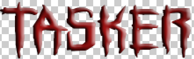
So going back to the drawing board, I went to Dafont again and this time searched for horror related fonts and I eventually found a font called Horroroid which I decided to use as my new font. My reasons for deciding on this font were because I liked how the font style made it look like it had been scratched onto the wall by a sharp object which is conventional in many horror films as it can be used to represent insanity. I also like how at the bottom of each letter it looks like that they are forming drips which could be used to symbolize blood which is very conventional to the horror genre. Afterwards, I then saw what it would look like if I my films title was in this font just to ensure it would work for my film.
 My next step was to edit the font to make it more conventional to the horror genre. I did this by firstly, changing the colour of the font to red as it is a very conventional colour for the horror genre as it connotes with meanings such as violence, death and blood. I then used several other effects to darken the colour and make the text look 3D so that it stood out more. You may also notice that I have added loads of holes into the letters and this was done as I wanted them to look like bullet holes so that they showed conventions from the action genre.
Step 1: Making the films title
Before I start make the poster I firstly decided to design the title for the film as every film poster shows off its title in large, detailed fonts to make them stand out from other films so that audiences can recognize the film just by looking at its font. This is seen in films old and new such as the Back to the Future (1985) which has its vibrant orange font and the arrow pointing towards the word back hinting at the films use of time travel and The Avengers (2012) which also uses a bold font with the most noticeable part being the letter A which is actually from the Stark towers headquarters the home of marvel superhero Iron man which will be recognized by comic book fans hyping them up for the film.
| Army Rangers font |
| Army Rangers font with our films title |
So I began creating the title but I needed to find a font that I could use that suited my film. To find the ideal font I went back to the plot synopsis my group created to see if there was anything I could use as reference when finding the font. This lead me to looking for military styled fonts as the plot of our film is a army strike force hunting down a escaped convict. Eventually I found a font on the website Dafont called army rangers which is based on the fonts used in many 80's action films. Before I used the font I decided to quickly see what the films title would look like in this font so after a quick test I decided this would be the perfect font for the film.
| Coloured font |
| Stripped font |
Now I could start editing the font to make it look more unique so that it stood out more. I started by changing the colours and settled on the colours red and blue as I wanted to the font to give of a patriotic vibe so I used colours of the American flag as the country as a whole is commonly associated as being very patriotic so I felt it would be a good use of the colours. I then decided to further apply this reference by adding white striped to the red stars as the stars and stripes are the key things on the American flag and our commonly associated with them.
To finish the title of I decided to step away from the patriotic vibe and went closer to the army effect as it is a key part of our film. So to do this I used the dodge tool which is used to brighten parts of photographs which can be used to make things look more detailed. However, I used the dodge tool to make parts of the font to look rusty and worn out. I feel like this helped create a army atmosphere as it reminded me of the conditions of army vehicles as they are designed to survive treacherous landscapes which they do but over time they show signs of rust and decay so I wanted to convey that effect in the font. Below you can see the finished font that will be used in the final poster.

But as I later realized after receiving some vital feedback on the poster I decided that I needed to completely overhaul the main font that I had been using. This was mainly because the poster had far to many conventions of the action genre with very little of the horror genre which made them look like that they had been tagged onto the poster at the last minute which made it look less professional.
 |
| My films title in this font |
 |
| The new font |
 My next step was to edit the font to make it more conventional to the horror genre. I did this by firstly, changing the colour of the font to red as it is a very conventional colour for the horror genre as it connotes with meanings such as violence, death and blood. I then used several other effects to darken the colour and make the text look 3D so that it stood out more. You may also notice that I have added loads of holes into the letters and this was done as I wanted them to look like bullet holes so that they showed conventions from the action genre.
Step 2: Taking photos
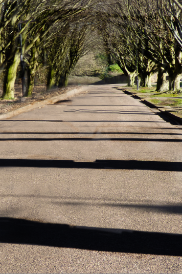
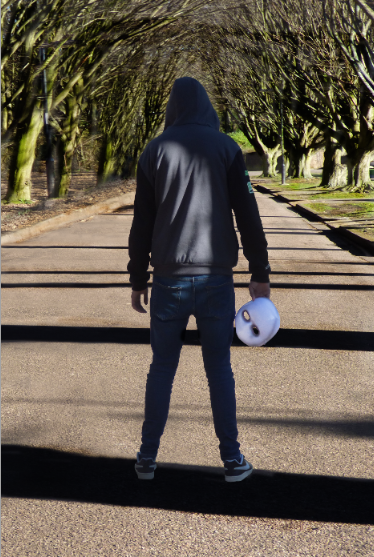
The next step was to take the photographs that will be used as the background for the poster. To determine the location we decided to pick one of the locations from the location recce we did as we were all familiar with them and it would make it easier to then set up a photo shoot. The location we choose was a small area between the park and the lane which was a small road with tall trees on each side of the road which created a long archway which blocked out a lot of light which could of made the photo to bright to use. We also used this location as it had a very quite road with no cars going past which allowed us to stand in the middle of the road to take photos in the centre of the tree archway. Here is the photo that we took I choose to use for our poster.


As you can see we have chosen to keep the identity of the villain hidden from the audience by having him face away from the camera. Another key thing convention about this poster is that I wanted to have the villains mask appear so that when watching the trailer the audience will be able to easily recognize who he villain is among all the characters but also to still hide who thy actually are to make the trailer more suspenseful.

Step 3: Editing the background

Now getting into the editing process, The first problem that I came across was that the villain was not positioned in the centre of the road as this would make the poster look less professional so to fix this I firstly cropped the photo so that the road was the centre piece of the photo.

I then had to use the lasso tool around the villain so that I could create a duplicate of them so that I could reinsert them into the poster once I have finished changing the background.

With the duplicate created I used the clone stamp tool on the original image to remove the model from it completely. As you can see it is easy to tell where the villain was in the photo as many of the textures in the photo overlap with each other with others just being the same part of the photo looped over and over again.
 However, this was why I created a duplicate for the villain as I could then place them over the edited background making it look like they were never removed in the first place which also hides all of the edited areas of the background.
 After this I realized that because of me changing lots of the background around it made the colours in the background appear to be mixed up with some parts being to bright and others to dark. So I used the contrast tool to change the colours in the photo to make them blend together better. This is finished up the background for the poster so I could move on to adding text into the poster. Another thing that this did was make the villain blend in better with the background because he originally looked like he had been pasted over the background instead of being an actual part of it.


 The first thing that I added was the IMAX and Dolby Digital logos to go into the billings block as one of the part of the billings block is showing what formats the film is going to be shown in each with their own perks. To do this what I did was find images of their logos and then change the colours of both of them to white and then gave them a black outline so that they would stand out more when I inserted them into the poster which can be seen below:


I then had to use the lasso tool around the villain so that I could create a duplicate of them so that I could reinsert them into the poster once I have finished changing the background.
With the duplicate created I used the clone stamp tool on the original image to remove the model from it completely. As you can see it is easy to tell where the villain was in the photo as many of the textures in the photo overlap with each other with others just being the same part of the photo looped over and over again.

Step 4: Adding text
With the main background of the poster finished I could now start adding text to the poster to finish it off. But before I do this there are a few more words that I need to create using the films main font. The first of these was that I needed to make the last names of all the actors as all film posters will have the main actors name appear at the very top of the poster. It is also conventional of the action genre to only have the last names of the actors appear because they are so well known audiences can recognize them from their last names alone. This can be seen in films such as The Expendables (2010) where all of the main actors last names appear on the poster such as Stallone and Willis and audiences immediately know that they are talking about Sylvester Stallone and Bruce Willis. When I created the new text I followed the same steps that I did for the logos font such as darkening the colours to make them look more intense and using effects to make them look more 3D. However, I decided to not use the same bullet hole effect that I used on the main logo as I wanted to differentiate it slightly so that it didn't look like I had just copy and pasted what I did. These can be seen below:


The next piece of text that I needed to create was the coming soon text as this would be used to tell the audience that the film will be released soon while not giving a definitive date for this release this is done with many films that have only recently started development which makes a it difficult to decide its release date so by putting coming soon or coming 'insert year' it gives the producers some leeway before needing to announce the date. The coming soon text can be seen here:

With all of these done I could then add insert them into my poster to see how well they fit with my background image.

While I like the font style I thought that it was not well suited for the background image as the dark red colour of the text did not fit well with the strong vibrant colours of the trees and ground so to make them blend in better I used the photo filter tool to add a slight but effective red filter to the entire poster.

This made the font fit much better with the poster as it makes the the background look faded and drained as if it had been drained of life while the strong bold red colours of the font contrast this making it look as if it has absorbed all of the colour from the background so that it becomes stronger.
The next piece of text that I went on to create was the films tagline which is a short but intense phrase that normally sums up the plot in extremely briefly which attracts audiences as it makes them become interested as to what the tagline could mean compelling them to go and see the film. A famous example of a tagline being used to attract audiences to see the film is from the first Jurassic Park (1993) which had the tagline 'An adventure 65 million years in the making' which doesn't give away any of the films plot but does makes the film sound far more interesting as it implies that for 65 million years we have been up this point as we have gone from dinosaurs ruling the earth to the ever expanding society of humanity and this film will show both of these worlds colliding and this is exactly what audiences will want to see.
So the first thing that needed to be done was for us to think on what our tagline would be. We choose that it would be more action related as after I added the red filter to the poster it looked much more conventional to the horror genre so I wanted to try and balance it out by adding more action related conventions. The tagline that we eventually decided on was 'When all is lost they fight on' we choose this as we liked the message it conveyed which made the heroes look more powerful and heroic as it means that when the whole world has gone to hell and all hope is lost they will continue fight on as they are the last bit of hope humanity has.

So it came down to creating the tagline for real. I started by typing out the tagline and changing the font colour to white. I did this so that I could then add a drop shadow to it which acted as a outline for the text which made it much more visible.
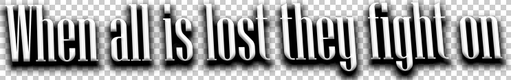
The next thing that I did to the text was use the 3D effect I have been using as it wanted to make sure that it stood out as I needed to make sure that the tagline was easily seen on the poster.

After this I decide to change the font colour from a white to grey tone this was because when I tested the tagline by inserting it into the poster it looked very bland compared to the rest of the poster so I felt that changing the colour would make it look better when inserting it into the poster.

I then used the inner glow tool on the test as it would light up all of the separate letters and this fit well with the grey font colour I choose as they blended well together while the glow made all of the text much more clearer to see.

The final thing that I did to the tagline was use the perspective tool to change the way how the text looked as I wanted to make it look unique compared to the rest of the text that I had used. I was inspired to change the font to this style as it reminded me of the font used in the Star Wars opening credits as the perspective of the font made the credits look like they were getting smaller as they progressed their way up the screen. Like the previous text I then added it to the poster to see what it would look like.

The final piece of text that I needed to create was the billings block which is the large piece of text that shows names of the people who created the film such as the producer, director, editor, cinematographer and more. Before I could start creating the billings block my group needed to decide on who had what roles as while we had discussed our main roles in past we needed to discuss who had the other roles. Once we had the roles figured out I started creating the right text font as all billings block share the same font.

How I did this was first by typing out the entire billings block in white and using a black outline so that I could see it clearly.

Once I checked that I got all of the roles right I then removed the black outline replacing it with a much more faded one so that it looked much more similar to a billings block on an actual poster.

The final step that I did was using the transform tool on the test to slightly flatten it so that the letters looked like they were close together. This also made the letters look taller because of them being pushed closer together. Once this was finished I inserted it into the poster.

Step 5: Making it look professional
The final step for me to do was add minor things into the poster that would make it look more professional once they have all been added

The next thing that I added to the poster were links to social media pages as this is an important convention for a poster to have as it allows the audience to follow the production of the film through social media due to how popular it is. I have decided that I would include the logos for Facebook, Twitter and Instagram with the films social media page linked under it so that when my audience views the poster they will see the links and want to go to them so they can follow the hype while the film is being made. Once these were finished I added them to the poster and below you can see the final design.

Subscribe to:
Comments (Atom)