Magazine Cover 1: Empire

The first magazine cover that I'll be analysing is created by Empire magazines. As you can see the main focus of the magazine is advertising the film Captain America The Winter Soldier (2014) which the readers can easily tell as an image of Captain America covers the entire cover even covering the title of the magazine. However, what is interesting is that all other text is in front of him which shows that important information will always appear in front of everything on the cover so the readers can easily view it.
Another thing that I noticed is that a lot of the information on the cover directly talks about what is on the inside of the magazine for example the bottom right corner advertises that this issue is there Scarface special which will then make potential readers want to see whats inside leading to them buying the magazine. This can also be seen on the left side of the magazine as it shows a preview of all the upcoming films of the year which will further compel people to want to buy the magazine.
What I can also see on the cover is that they have used the word exclusive to advertise one of the magazines feature articles. This is beneficial to them because it will attract a larger audience of people who will want to read the magazine as it contains an article that can only be found in there magazines which will make the readers feel they are getting something special out of buying it.
Magazine Cover 2: Total Film

The next magazine is created by Total Film. Looking at the magazine you can see many similarities to the empire magazine as they both have the characters from the film appearing over the title of the magazine but still have other important information appear in front of them so that the readers can easily see what content is inside the magazine. Both magazines also advertise exclusives inside them which will make more people want to buy them more so they can learn facts about the film that no one else would be showing.
However, what is different about this magazine is that they use descriptive words to make its content sound more interesting. For example, instead of exclusive Total Films use world exclusive which will attract more people as they will want to read about something that cant be found anywhere else in the world. Also when they describe the film they use alliteration to make the description more interesting with them saying that The Martian (2015) is 'GRITTY, GRIPPING... GARDENING?' now the first two words are to describe the film saying its a thrilling, intense film nut then they use are word that stands out among the others which will confuse people who read it which will lead to them wondering what they mean by gardening and will then purchase the magazine to read the article. Another thing that I noticed about this magazine cover is that the colours of the text conforms with the colours on the characters costume which makes them all blend in well together.
Magazine Cover 3: Sight & Sound

This is a magazine cover created by Sight & Sound. Now comparing this poster to the previous two this one looks very different. What stands out to me the most is the lack of information compared to the other magazines all it shows is the films title (The Revenant, 2015), the main actor and director and some of other articles. Now I believe this was done as while its simple it also makes it easy to see the information as it can all be found in the same place making it easy to view which is convenient for the readers.
I can also see that they also advertise the best films of 2015 on the front cover which is in a bright red circle. I believe this was done because the red contrasts from the dark blues and whites from the film screen shot so that people will immediately see it when they view the cover and this could then compel them to buy the magazine. Speaking of buying the magazine, what I like about this magazine is that the bar code is visible on the front cover which also shows the price of the magazine which is also convenient for readers as they can immediately see how much the magazine will cost.
Magazine Cover 4: Entertainment Weekly
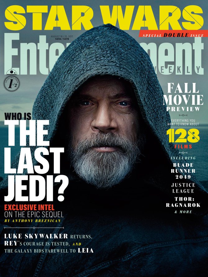
The final magazine cover I'll be analysing is from Entertainment Weekly. By looking at the magazine you can quickly tell that it is very similar to the first two covers with the information spread all over the cover using colours which blend in well with the film screen shot. However, one thing that I noticed that is different compared to those two is that it is using a variety of different fonts to display the information. This may of been done to point out important information to the readers with big bold text showing the main article in the magazine which in this case is about The Last Jedi (2017) whereas all other articles in the magazine are described using smaller text as it is less important, In contrast this could of also been done to save space on the cover so that the text doesn't cover up the entire picture.
What I also noticed about this cover is that while Luke Skywalker's face still covers the title like all the other covers it takes up a lot more space compared to the others which covered up a single letters or parts of them but you could still make out what the title was. However, with this cover a large part of the title is covered blocking several letters and while we can still make out the title if it was a smaller word it would of been blocked out entirely. One thing what I like about the title is how they have the word weekly inside the word entertainment as that part can be clearly seen so readers will still be able to make out the title of the magazine.
Similarities
These magazine covers share many similarities with each other which is good as it means that they are all very conventional and I will be able to use them when my group creates our magazine cover. Here is the list of the main conventions that I could find:
- All the magazine cover have a screen shot of the main character from the film there main article is about and they have the characters face cover the magazines title but make sure that important information about the content of the magazine is in front of the character so it can be seen.
- The magazine title is in big bold text so that it can easily be seen and recognised even with a character covering part of it. They also use strong bold colours to attract audiences as it makes them stand out among other magazines making people want to read them.
- Magazines also advertise exclusive articles that only they have inside of them to make people want to buy them so that they can read them as they will not be able to the read the article any where else.
- Another convention that is shared between all the posters is the colour rule of 3 where the magazine uses 3 main colours that conform with the image on the magazine for example the Total Film magazine uses oranges, whites and greys as they fit well with Matt Damon's costume. Many of the posters also go against this rule as they will then use colours that deliberately stand out as it makes more people notice the colours making them want to read the magazine more.
No comments:
Post a Comment